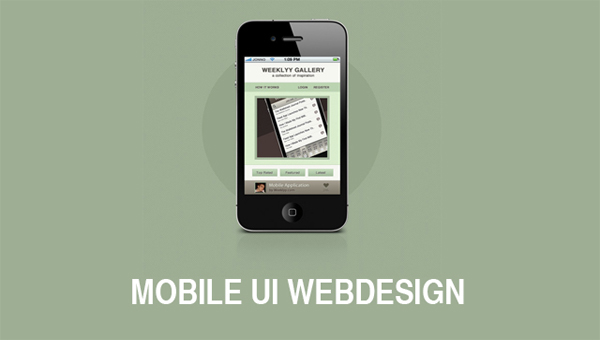
Designing was always a challenge for the designers. Today a design, which is very new and accepted by the audience full heartedly, be complete isolate tomorrow. The design is changing like anything and so as audience choices but at this time what should the designers do. Most of the time I find designers stick with few design pattern and never adopt to the upcoming designs. This is the biggest factor that I identified with today’s designers. Now mobile screen designs also came into the market, which ultimately increase the challenge for the designers.
We have find good designers are always ready to learn new things. Let us talk about the mobile designs. I have seen designers think designing for mobile devices are same as web, which is not.The challenge is huge here. First of all the size of the screen matters in mobile. You cannot get a big screen to accommodate all of your data and images. The space is very limited. Thus, you have to think twice before designing for mobile. You have to keep all the important links, images and functionalities in mind. Then you need to accommodate those things first, such that the users should not struggle to find the important things first.
In simple sentence, you need to know how to priorities the elements in the mobile screens and then you need to create the flow in such a way that user should not struggle with the application. You need to remove things or keep them somewhere else, which are not important for the application as about us page, company policies etc. font size, image size etc. are very important for mobile devices as it have very limited space and you cannot experiment with the size of the application.
If you keep all the above things in mind while developing mobile user interfaces then you might be omitting lot of rework and hassles for you in coming future.
Rational Technologies is here to help you. We are a web development and web design company in Hyderabad India offering our services to people across the world.

